(hover to see more, click to learn more)


___
Agency Work /
Coma


___
Agency Work /
Studio Space
.gif)

___
Creative Project /
Autonomous


___
Agency Work /
Panea


___
Creative Project /
Grace Ling


___
Agency Work /
PRETTY RUMOUR


___
Agency Work /
JCPAJARES


___
Creative Project /
Autonomous


___
Agency Work /
1Mentor


___
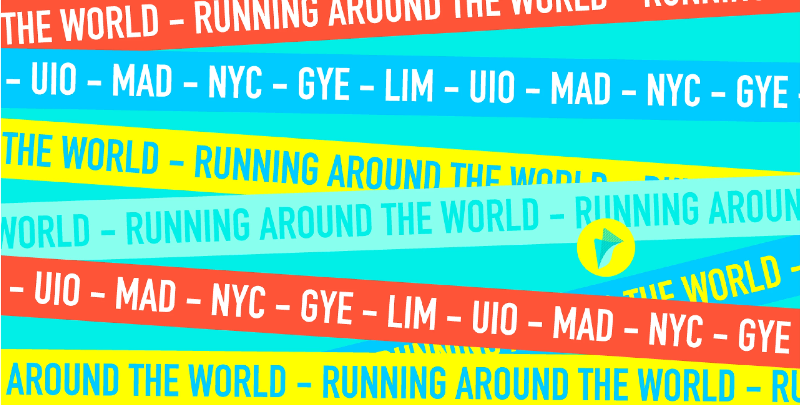
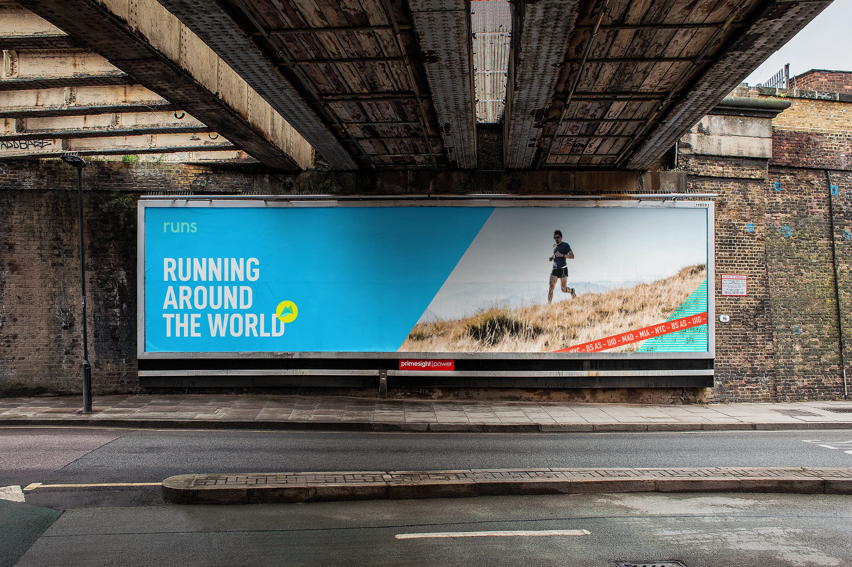
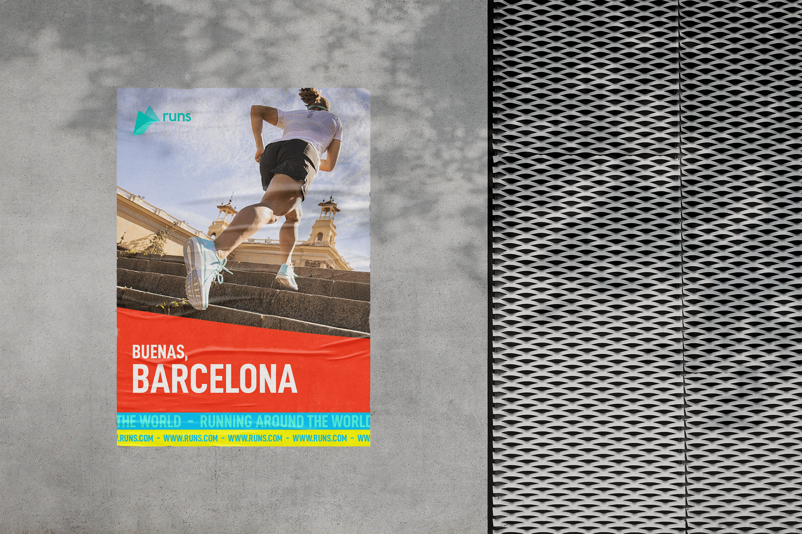
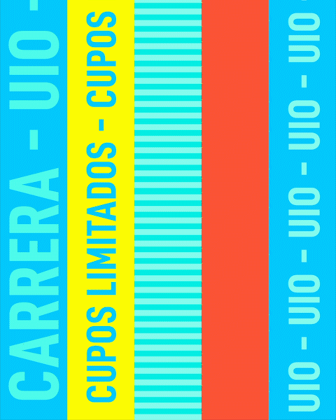
Agency Work /
Ecuador Runs


___
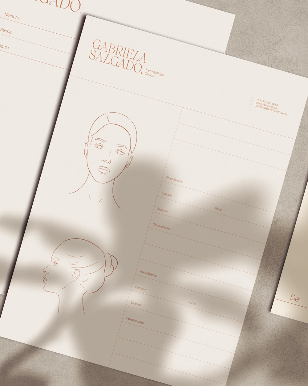
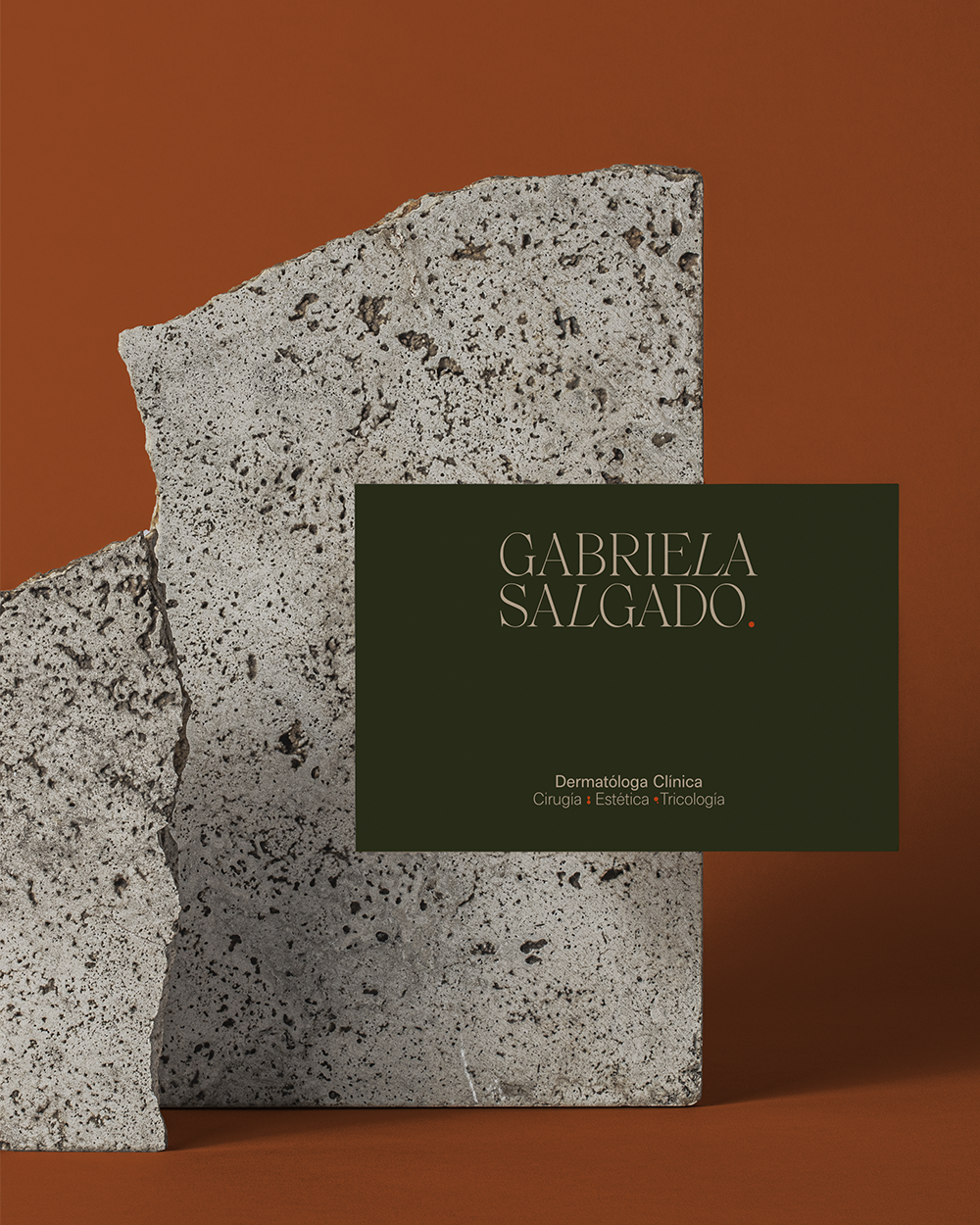
Agency Work /
Gabriela Salgado
___
Agency Work /
A.SHIMUS


___
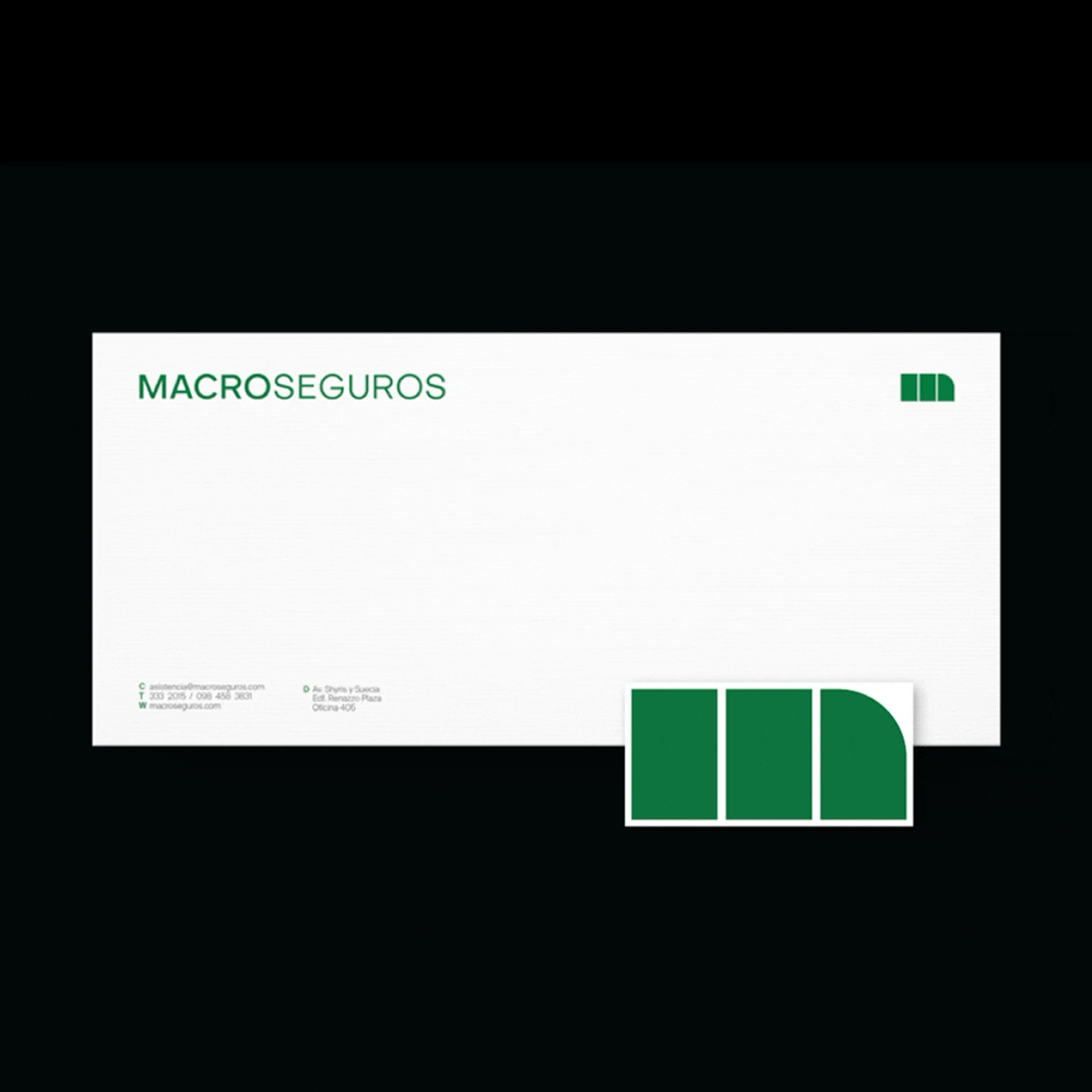
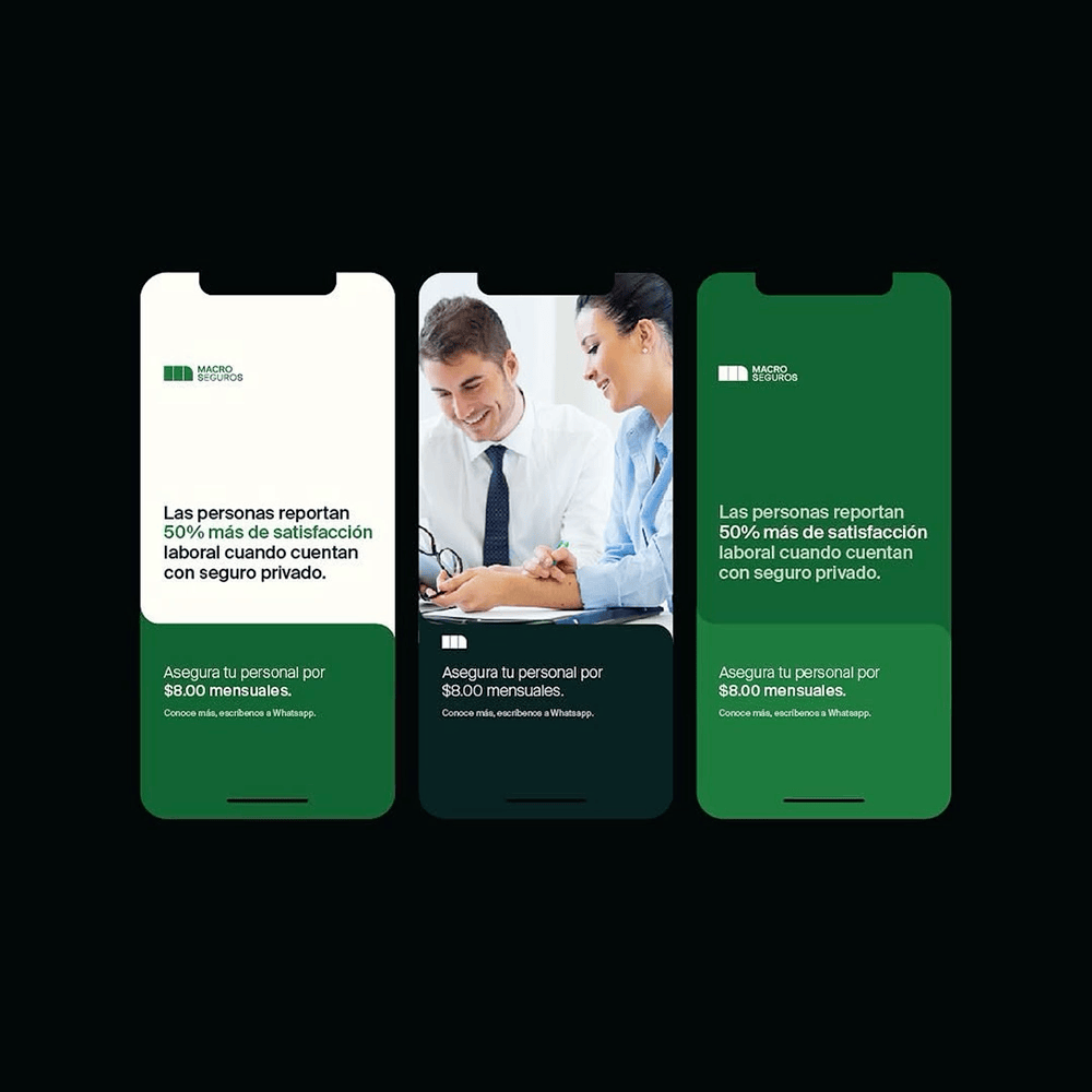
Agency Work /
MACROSEGUROS


___
Creative Project /
Autonomus

___
Agency Work /


___
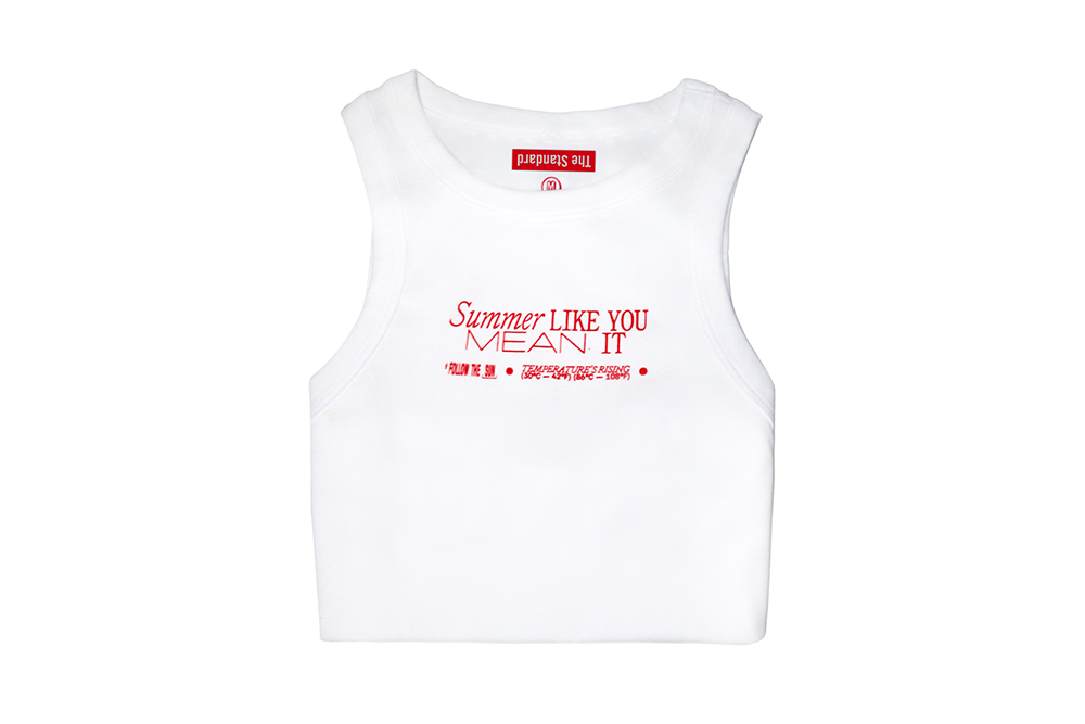
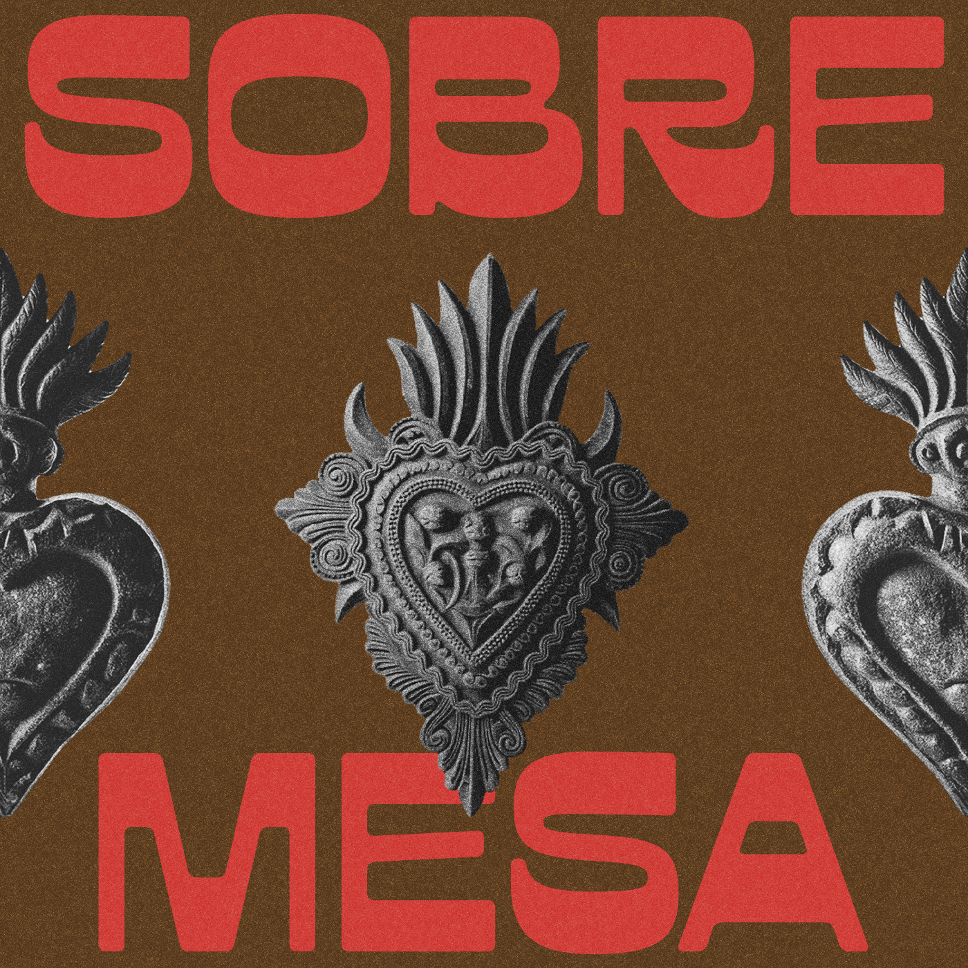
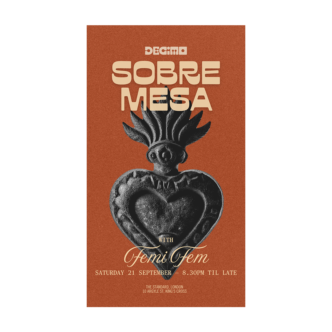
Agency Work /
The Standard


___
Creative Project /
Autonomous


___
Agency Work /
The Manner


___
Creative Project /
Autonomus


___
Agency Work /
Anamá


___
Agency Work /
Bon Vivant
___

___
Creative Project /
Autonomous

___
Creative Project /
Autonomous


___
Agency Work /
The Standard
___
___


___
Creative Project /
Autonomous
___

___
Creative Project /
Autonomous