


.gif)

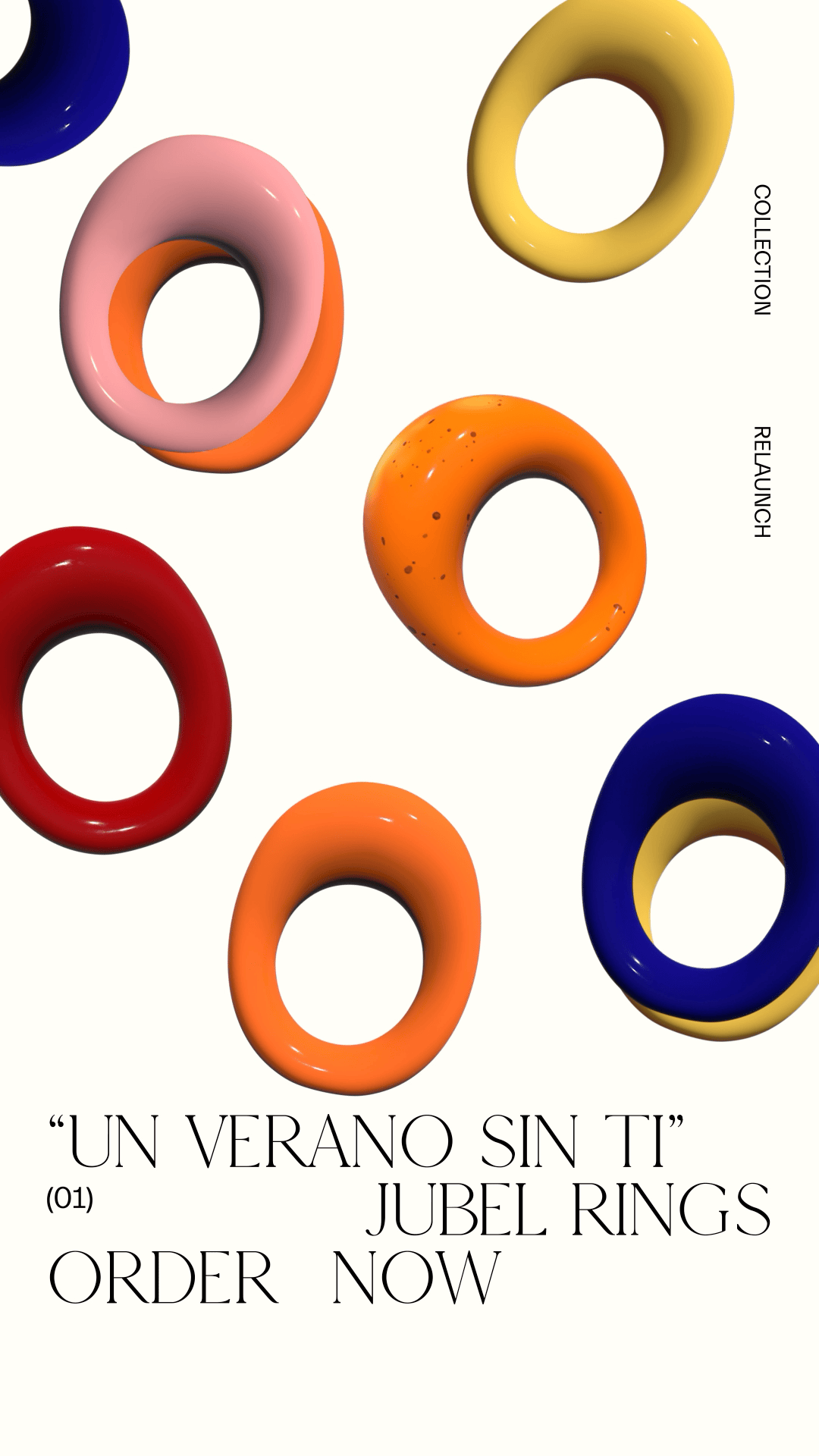
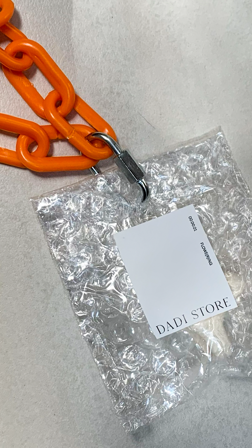
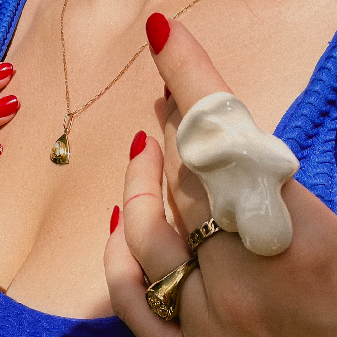
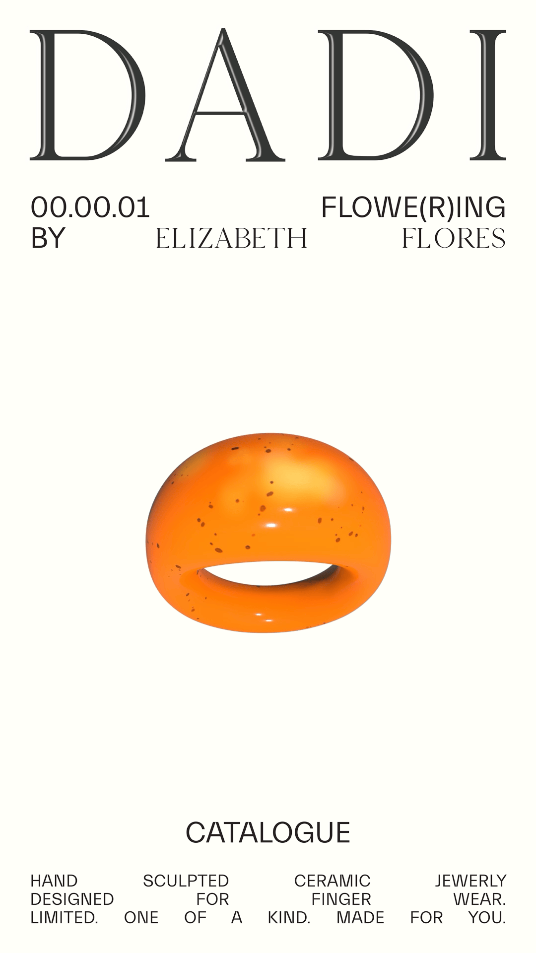
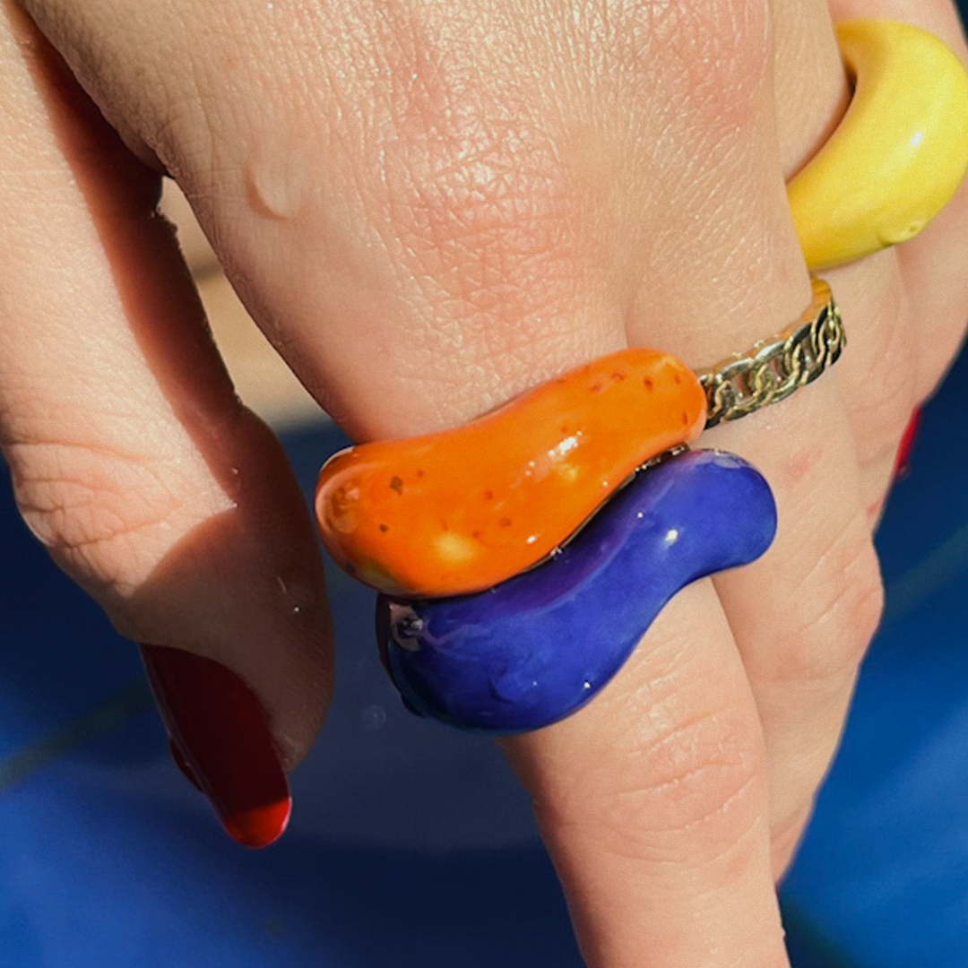
Visual identity and rollout for a ceramic ring series, entirely hand-sculpted as a personal side project. Each piece features organic, irregular forms, custom-crafted for wearability and individuality. The debut collection, Agosto, draws conceptual and visual inspiration from Bad Bunny’s Un Verano Sin Ti, translating the album’s mood into a tactile language of form, color, and narrative. The identity system extends this emotional thread—through naming, palette, and imagery—bridging music, memory, and material into a cohesive, collectible body of work.


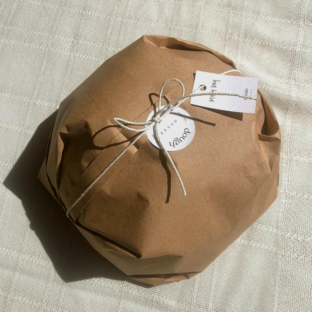


Panea is an artisanal sourdough bakery where baking meets design. Rooted in the intersection of food and art, its visual identity reflects the purity of its ingredients—simple, essential, and intentional. Graphic elements are distilled to their core, mirroring the craft of sourdough itself: raw yet refined. The logo subtly emphasizes “pan” (bread), striking a balance between strength and delicacy, embodying the brand’s soft, understated sophistication.


PRETTY RUMOUR creates custom handmade jewelry crafted from high-quality metals and stones. To capture the essence of its work—both simple and sophisticated—the graphic system leverages the contrast between a decorative serif and a clean, straightforward sans serif. This approach reflects the balance between the artistry of craftsmanship and the raw edge of silversmithing. The rest of the brand is enriched with visual imagery that showcases the jewelry's versatility and purpose. The human form is seamlessly integrated into the visuals, serving as a canvas that brings the pieces to life.


Pursuing a refined evolution of its minimalistic and bold brand identity, integrating 3D and motion elements to signal modernization while preserving its core essence. The introduction of a serif typeface was a strategic choice—designed to appeal to a more sophisticated, upscale feminine audience by adding a layer of maturity and elegance.
For the e-commerce platform, the objective was clear: maintain simplicity for an intuitive user experience without sacrificing visual interest. The incorporation of 3D and motion was meticulously balanced to enhance engagement and ensure a seamless alignment with the updated brand identity, creating an interface that is both technically robust and aesthetically cohesive.


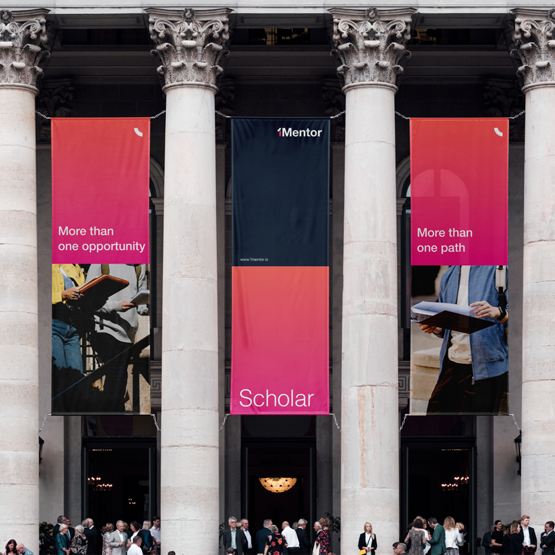
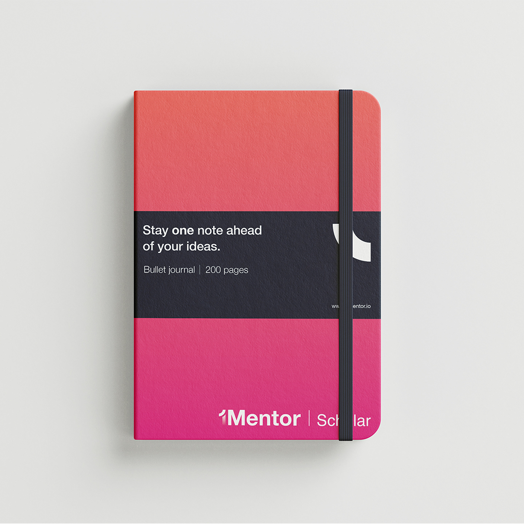
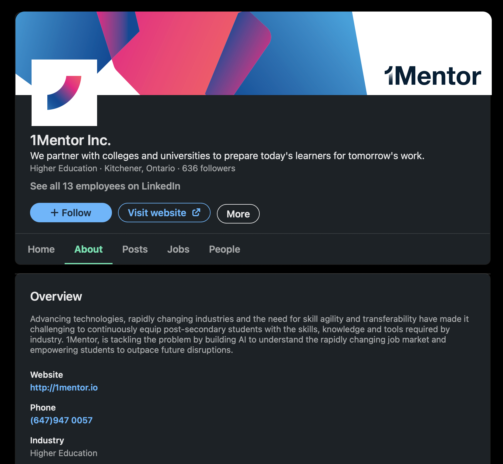
1Mentor bridges the gap between education and industry, helping students and institutions navigate the ever-shifting landscape of skills and technology. As part of the brand strategy, we identified two key audiences—learners and advisors—and built a dual structure under a single, unified identity: 1Mentor Learner and 1Mentor Advisor. This framework reflects the platform’s purpose of connecting both sides of the learning experience while maintaining a cohesive visual and strategic foundation.
The visual language was designed to bring warmth and humanity to what could otherwise feel highly procedural. Geometric forms and modular compositions interact and adapt, mirroring how knowledge, skills, and people connect in motion. The color palette carries this same dialogue—balancing the vitality and curiosity of students with the clarity and trust sought by institutions. Through this interplay of form and tone, the identity transforms a structured system into something approachable and dynamic, embodying 1Mentor’s mission to make future readiness both intelligent and accessible.

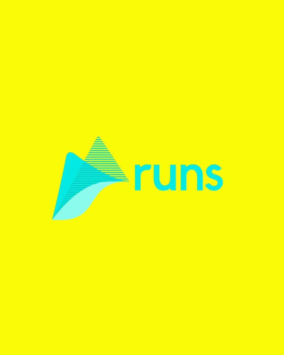
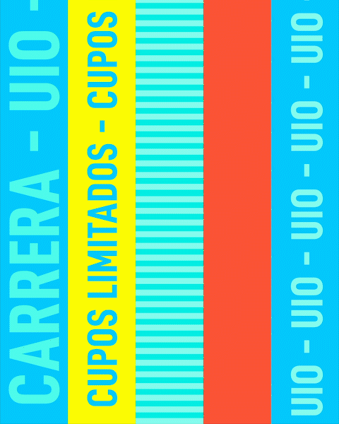
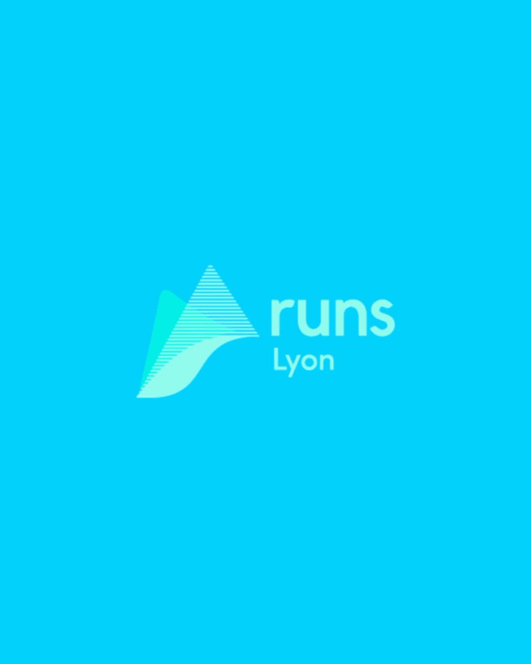
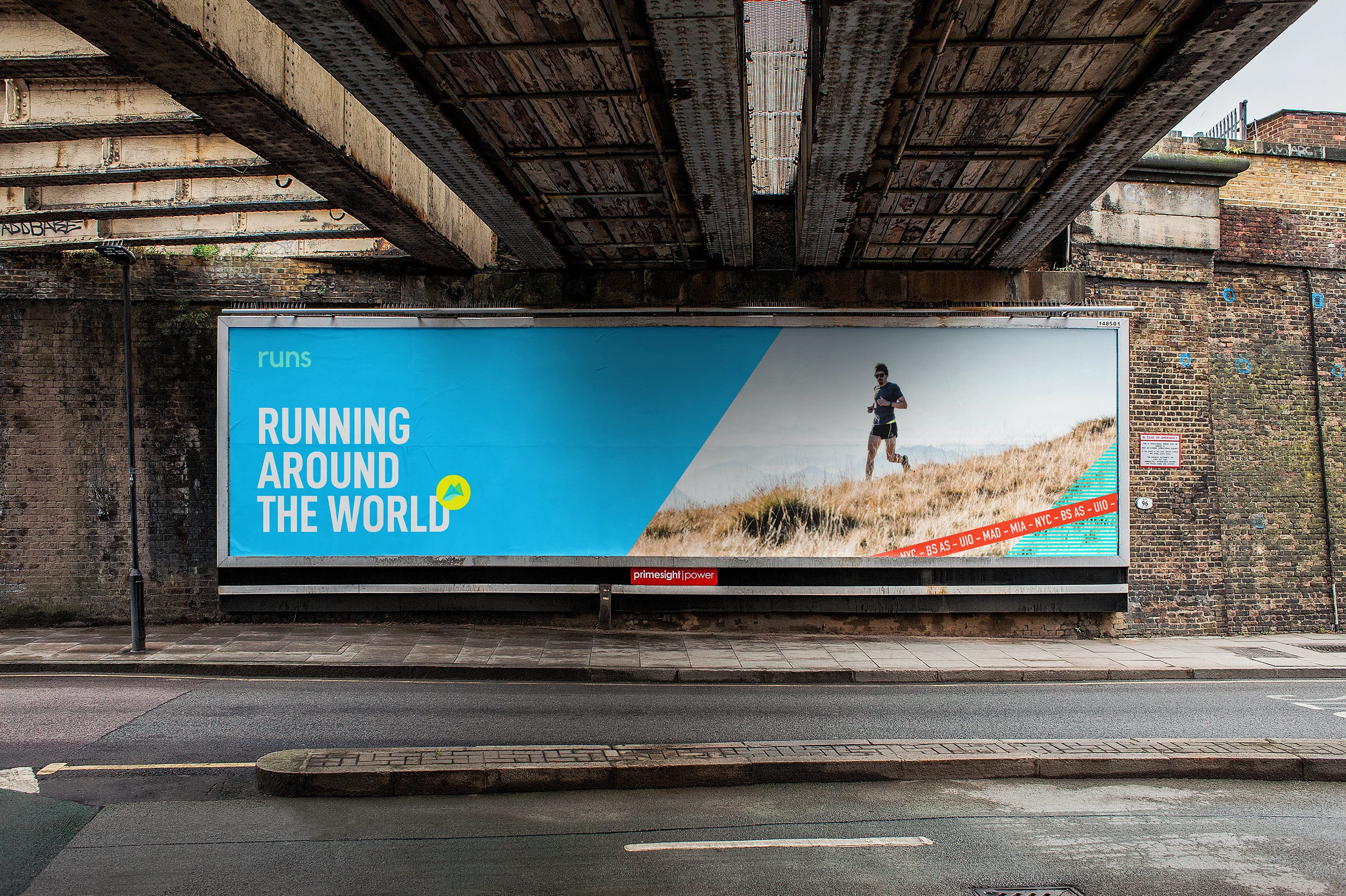
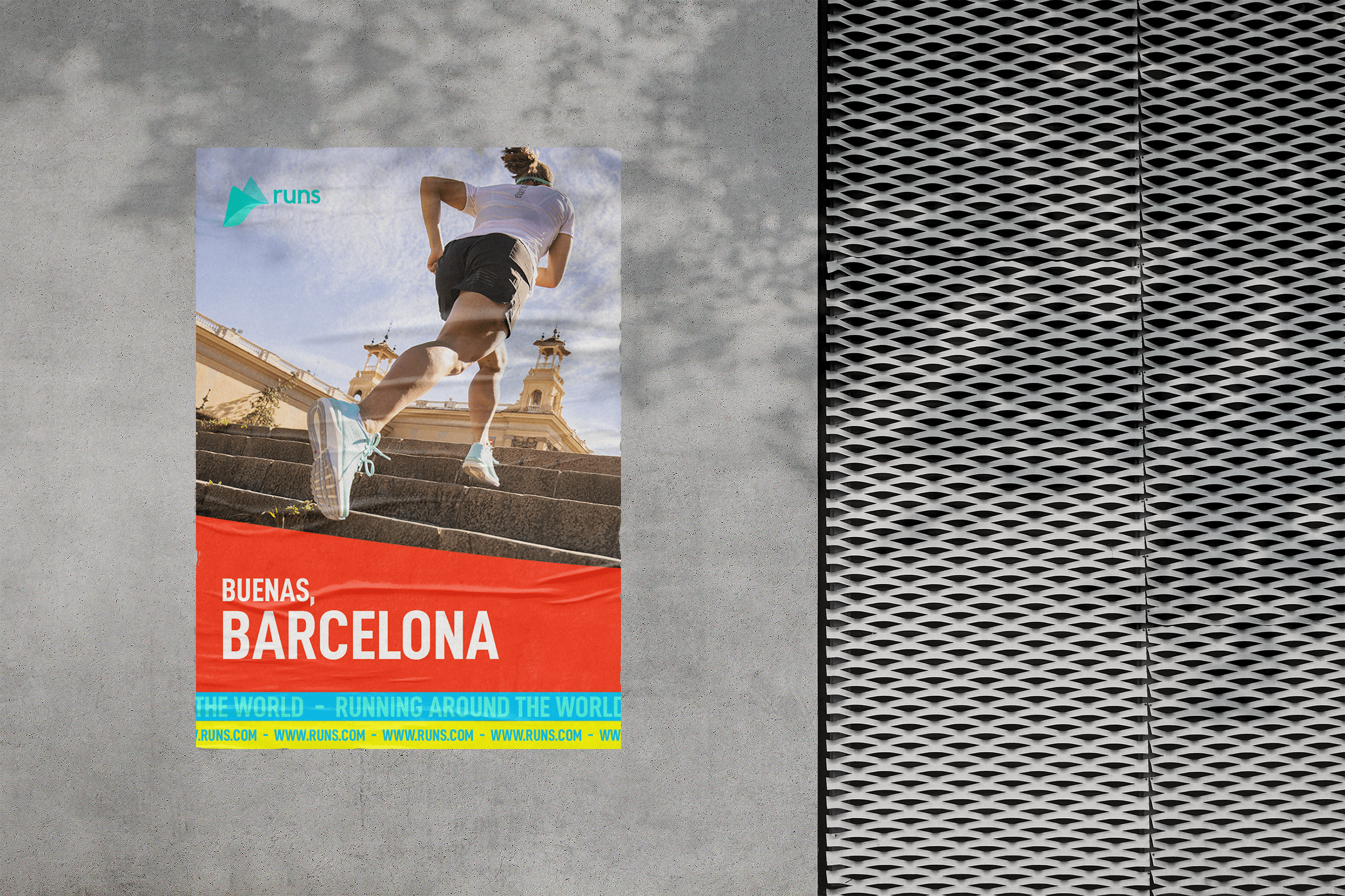
Runs is the pulse of a global community bound by the universal act of running. What began as a local initiative quickly grew into a movement—one that embraces runners of every level, from first-timers to professionals, united by passion wherever they are. Our role was to guide this transition from local brand to international identity, preserving its vibrant spirit while refining it for global reach. The logotype was reimagined with softer, more organic forms to feel approachable yet performance-driven, and supported by a flexible system that adapts city names to highlight the brand’s local presence within its worldwide network.
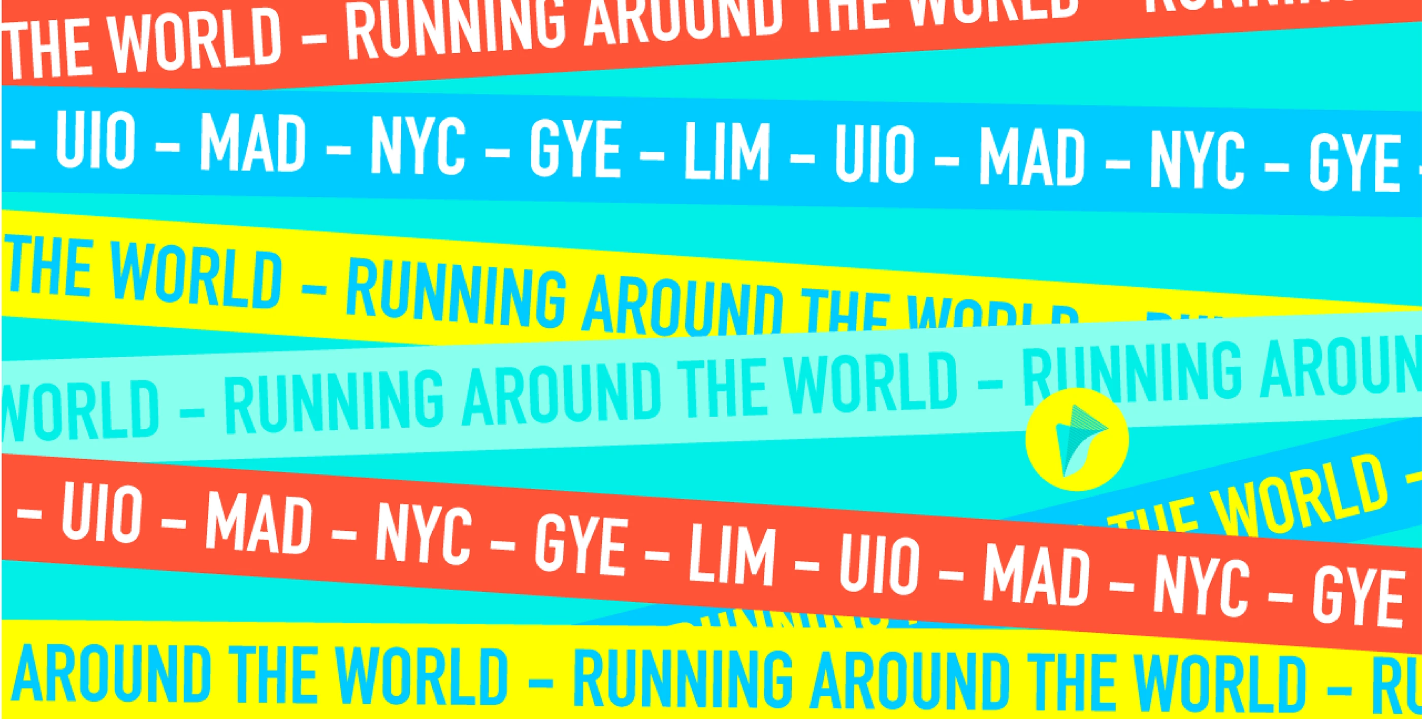
The visual language is anchored by a dynamic pattern that distills the essence of running: rhythm, pace, and consistency. Versatile and adaptable, it can be cropped, shifted, or reconfigured to evoke diverse terrains—from mountains to city streets to indoor tracks—while maintaining cohesion across touchpoints. More than a brand identity, Runs functions as a framework for a community in motion: a design system that celebrates running as both a personal pursuit and a shared, global language.


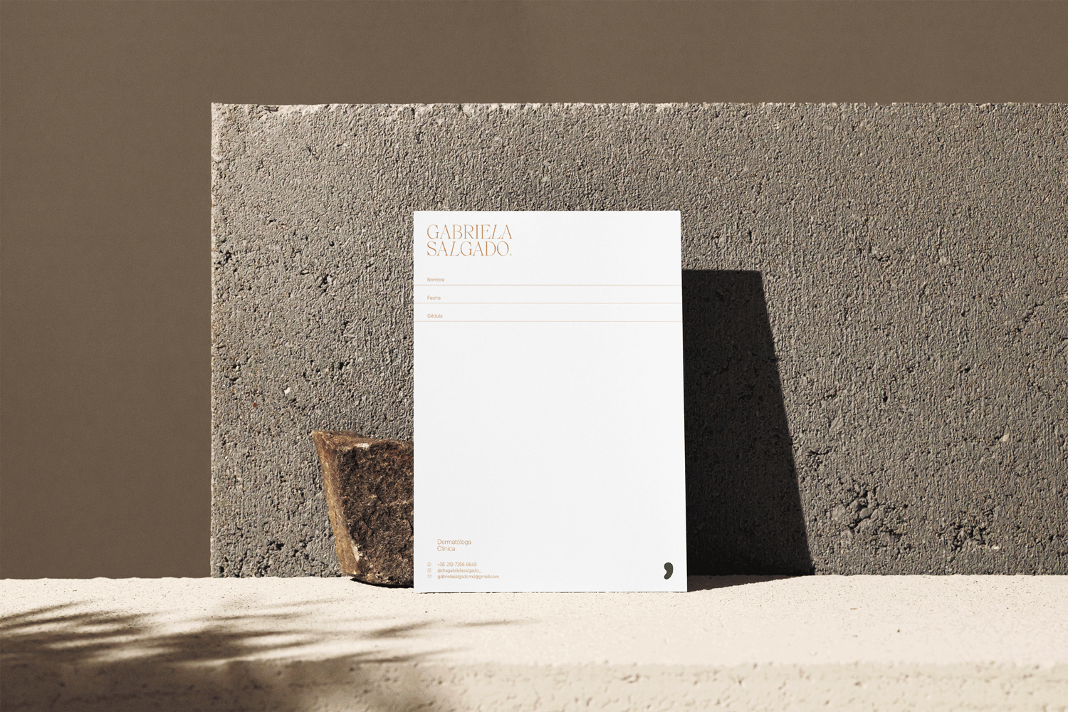


Brand identity and naming for Ana María Romo, a therapist and coach specializing in personal development and corporate well-being. The design balances professionalism with a sense of peace, harmony, and expertise.
Inspired by the concept of duality—light and dark, positive and negative, masculine and feminine—the visual identity reflects the ongoing pursuit of balance and self-discovery. This idea translates into key design elements: a monogram formed by two mirrored “A”s for symmetry, a complementary color palette for contrast, and fluid gradients symbolizing continuous growth and transformation. The result is a brand that feels timeless, intentional, and deeply aligned with its purpose.


Luxury Silk Sleepwear – Made in Colombia.
This brand embodies elegance and sophistication, weaving together the grandeur of classicism with a modern, understated edge. Rooted in the poetic allure of French Impressionism and the opulence of Versailles, the visual identity captures a sense of timeless regality.
The logo system is an intricate balance of monogram refinement and heraldic detail, inspired by the ornamental motifs found in historical records of the era. Every curve and embellishment is intentional—crafted to evoke prestige while maintaining a contemporary lightness. The result is an identity that feels both archival and fresh, a seamless blend of heritage and innovation.