Production assistance for set design by Studio Space. I worked on the sculpting of the runway’s centerpiece—carved entirely from foam to mimic natural rock formations. The structure was hand-shaped, textured, and painted, then mounted onto a metal base to appear as if floating. I assisted throughout the process: carving, finishing, transporting, assembling on site, and integrating dry ice to enhance the volcanic, Neanderthal-inspired concept.


Pursuing a refined evolution of its minimalistic and bold brand identity, integrating 3D and motion elements to signal modernization while preserving its core essence. The introduction of a serif typeface was a strategic choice—designed to appeal to a more sophisticated, upscale feminine audience by adding a layer of maturity and elegance.
For the e-commerce platform, the objective was clear: maintain simplicity for an intuitive user experience without sacrificing visual interest. The incorporation of 3D and motion was meticulously balanced to enhance engagement and ensure a seamless alignment with the updated brand identity, creating an interface that is both technically robust and aesthetically cohesive.

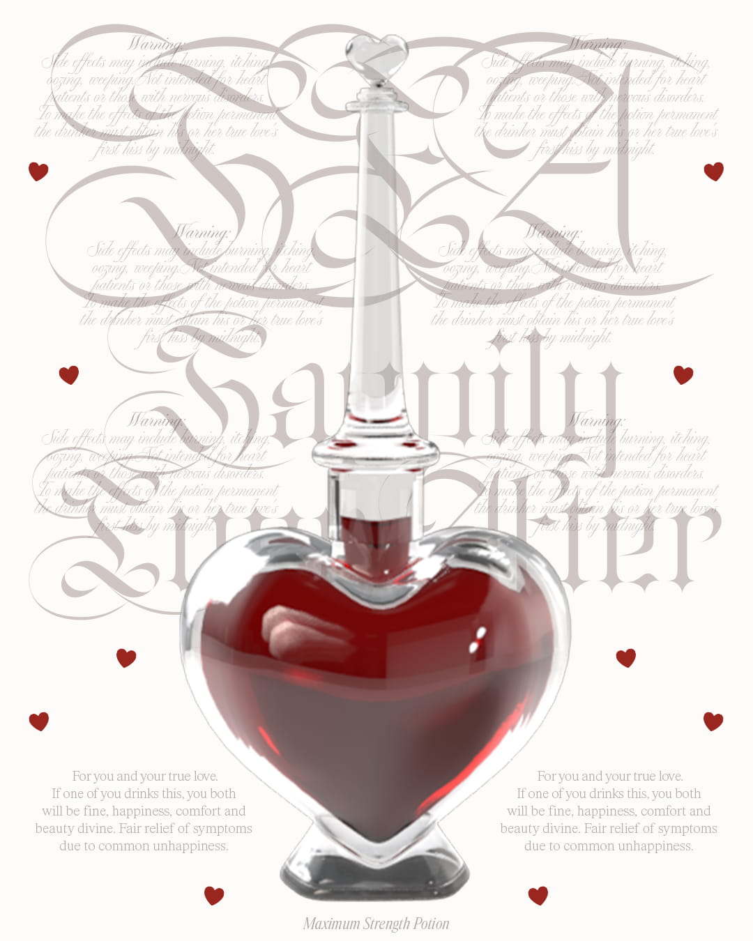
A Galentine’s Day project celebrating Valentine’s with my true love, best friend, and creative partner in everything, Carolina.
I focused on the type treatment while she modeled a custom 3D bottle from scratch, based on my direction and vision. The concept is a semi-gothic take on the iconic 'Love Potion' from the Fairy Godmother’s in Shrek 2.


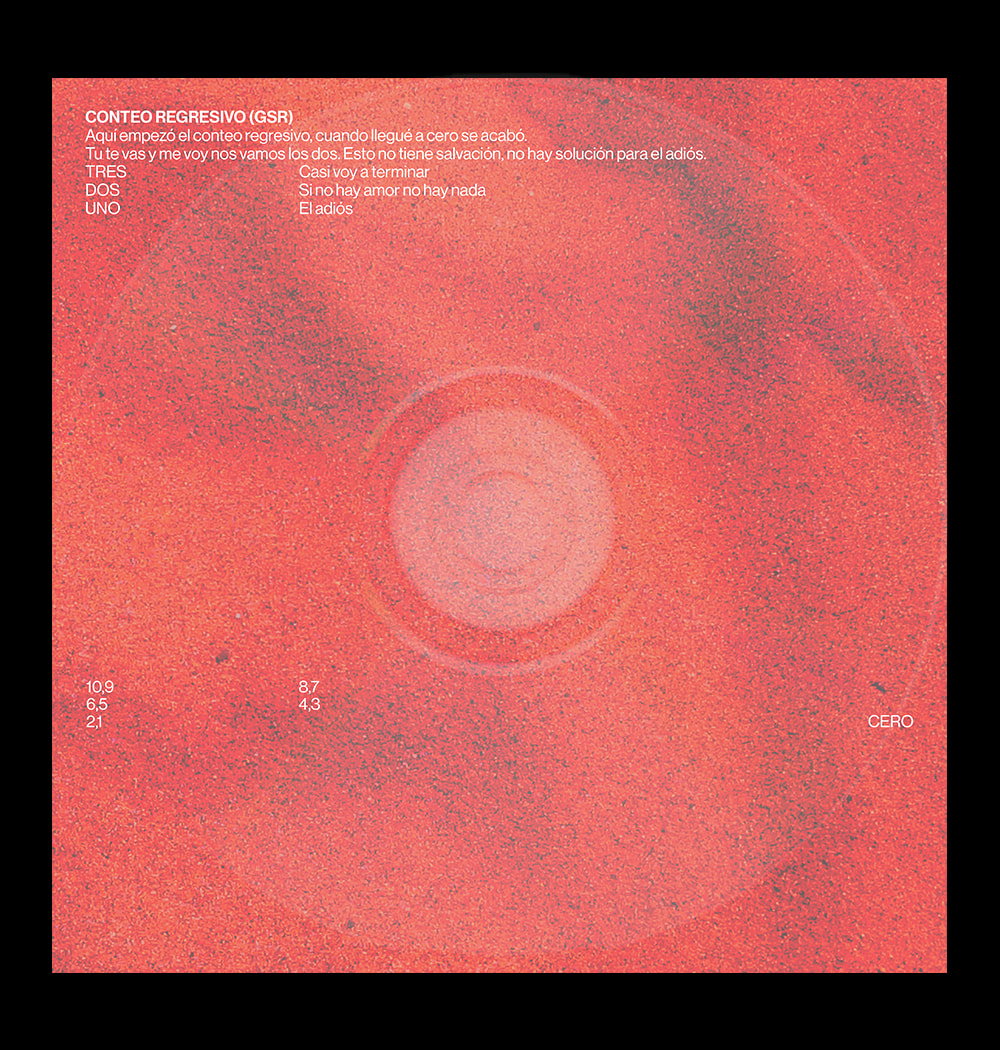
Got into The Office during the pandemic, watched episode after episode. One time, I spotted Dwight’s iconic desk sticker and felt like recreating it with my own design twist. A little ode to Dwight, Dunder Mifflin, and the exciting world of paper :)